Clouded Judgement 10.14.22
Every week I’ll provide updates on the latest trends in cloud software companies. Follow along to stay up to date!
Tail Risk
What a week. The WCLD index dropped >10% over the last week, and yesterday coming off of the CPI release the S&P swung >5% from it’s intraday low to intraday high (this is one of the largest intraday swings since the crazy volatility at the onset of Covid in March 2020). Furthermore, the S&P broke below its June lows to hit a new 1 year low. As I was reflecting on what’s driving the current market sentiment what I kept coming back to was tail risk. Right now, it feels like tail risk is back on the table. Tail risk describes the potential of a rare event, as predicted by a probability distribution (mathematically this is generally a move of 3 standard deviations outside the mean).
If the graph above represents a distribution curve of outcomes, you can think of tail risk as the red shaded area. In “normal” times tail risk is quite low. This is the blue distribution line. You can barely see the red shaded area under the curve. However, currently the distribution of outcomes is the orange line, which makes the possibility of tail risk much higher. Right now, I think the market is saying “the potential for a really bad outcome is quite high.” On top of that, it’s hard to quantify how bad the tail risk could truly be! What tail risk is on the table? 1) What is the trickle down effect of US rate policy on global economies? What happens to the UK pension crisis? Could other global economies collapse? 2) How bad could a 2023 recession really get? Jamie Dimon gave an ominous outlook. 3) Nuclear war. No one really knows how to quantify how bad these outcomes could be other than “it could be really bad.” For that reason, it’s hard to get long equities, and a lot of money is sitting risk off on the sidelines. Until some of the “unknown unknowns” become known, the risk reward math is hard to quantify when you don’t know the lower bound. Once we have more of a lower bound, it’s easier to build out an investing framework. In the summer I think we had tail risk on runaway hyper inflation and rates. I believe that set of tail risk is more known today.
CPI Report
September CPI came out yesterday, and like August it was higher than expected. Core CPI was 6.6% vs expectations of 6.5%. We now have a new high for core inflation (the previous high was 6.5% in March). The MoM change in core inflation was 0.6%. This gives further ammo for the Fed to hike rates higher than previously thought. Originally the market tanked Thursday morning, but it rebounded in a big way to end the day.
There are many gripes with Fed policy over the last 18 months, so I thought I’d summarize them here. In general, the biggest challenge with CPI data is that it’s a lagging indicator. Often times there are real time price changes we see that don’t show up in CPI data for 6-12 months (due to how CPI is calculated). This is the biggest challenge with using CPI as an input to rate policy. In Spring / Summer 2021 we started to see real world changes in consumer prices. At the same time we saw small upticks in CPI but nothing substantial. At that point in time, the Fed should have looked at the leading indicators of price changes and started hiking rates. Instead, they said the rising inflation was transitory and kept rates at 0. They didn’t start raising rates until it really showed up in the CPI data, but by that time it was too late!
What’s interesting, is you can make a similar (but opposite) claim now. We’re starting to see real time decreases in prices (look at housing), but things like shelter inflation are still going up (due to the lag)! At the same time, the rate hikes from the last few months take months to actually effect demand, so you can argue we haven’t really seen the effects of them yet. What does this imply? It implies that the leading indicators are showing that inflation is coming down. However, the Fed continues to hike rates. Skeptics claim the Fed was behind the curve in Summer ‘21, and is similarly behind the curve today using backward looking data when the forward looking data tells a different story. Cathie Wood penned an open letter to the Fed citing her grievances on this topic. You can find the full letter here
Top 10 EV / NTM Revenue Multiples
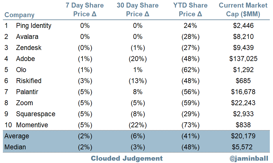
Top 10 Weekly Share Price Movement
Update on Multiples
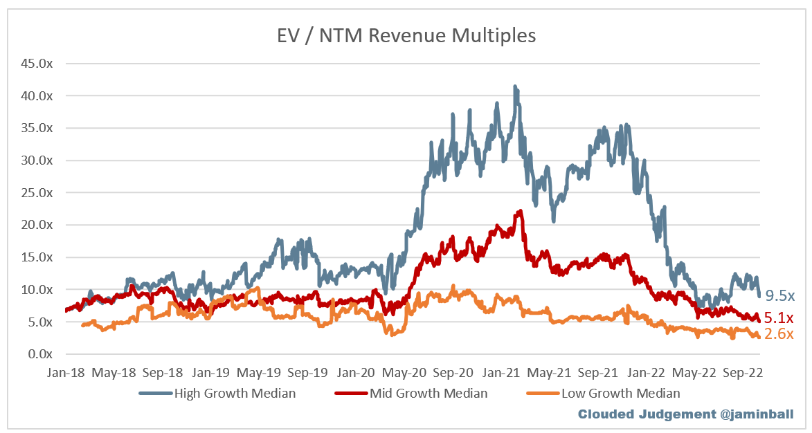
SaaS businesses are valued on a multiple of their revenue - in most cases the projected revenue for the next 12 months. Multiples shown below are calculated by taking the Enterprise Value (market cap + debt - cash) / NTM revenue.
Overall Stats:
Overall Median: 5.0x
Top 5 Median: 14.3x
10Y: 3.9%
Bucketed by Growth. In the buckets below I consider high growth >30% projected NTM growth, mid growth 15%-30% and low growth <15%
High Growth Median: 9.5x
Mid Growth Median: 5.1x
Low Growth Median: 2.6x
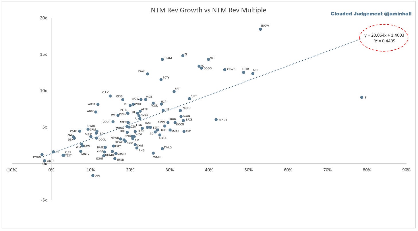
Scatter Plot of EV / NTM Rev Multiple vs NTM Rev Growth
How correlated is growth to valuation multiple?
Growth Adjusted EV / NTM Rev
The below chart shows the EV / NTM revenue multiple divided by NTM consensus growth expectations. The goal of this graph is to show how relatively cheap / expensive each stock is relative to their growth expectations
Operating Metrics
Median NTM growth rate: 21%
Median LTM growth rate: 30%
Median Gross Margin: 74%
Median Operating Margin (25%)
Median FCF Margin: 0%
Median Net Retention: 120%
Median CAC Payback: 33 months
Median S&M % Revenue: 48%
Median R&D % Revenue: 28%
Median G&A % Revenue: 20%
Comps Output
Rule of 40 shows LTM growth rate + LTM FCF Margin. FCF calculated as Cash Flow from Operations - Capital Expenditures
GM Adjusted Payback is calculated as: (Previous Q S&M) / (Net New ARR in Q x Gross Margin) x 12 . It shows the number of months it takes for a SaaS business to payback their fully burdened CAC on a gross profit basis. Most public companies don’t report net new ARR, so I’m taking an implied ARR metric (quarterly subscription revenue x 4). Net new ARR is simply the ARR of the current quarter, minus the ARR of the previous quarter. Companies that do not disclose subscription rev have been left out of the analysis and are listed as NA.
This post and the information presented are intended for informational purposes only. The views expressed herein are the author’s alone and do not constitute an offer to sell, or a recommendation to purchase, or a solicitation of an offer to buy, any security, nor a recommendation for any investment product or service. While certain information contained herein has been obtained from sources believed to be reliable, neither the author nor any of his employers or their affiliates have independently verified this information, and its accuracy and completeness cannot be guaranteed. Accordingly, no representation or warranty, express or implied, is made as to, and no reliance should be placed on, the fairness, accuracy, timeliness or completeness of this information. The author and all employers and their affiliated persons assume no liability for this information and no obligation to update the information or analysis contained herein in the future.


Nice article as usual Jamin!. Yesterdays market action was rather odd…..every stock turned almost on queue at approx 11:15 am. Don’t fully appreciate why, maybe quants programmatic trading. But for sure volatility like that is rarely predictive of stability in the market and perhaps directly implicates the long tail as you suggest. Just wonder what the massive amount of programmatic trading does to any thesis?
Another great report. When tail events are on the table, its informative to look at multiples over a very long period to identify the lowest trading range. Love to see Saas multiples over a 20 year period and understand the valleys.