Clouded Judgement 9.1.23 - Are Software Companies Over or Undervalued?
Every week I’ll provide updates on the latest trends in cloud software companies. Follow along to stay up to date!
Are Software Companies Over or Undervalued?
Today I wanted to dig in to this question and its implications: “Are software companies fairly valued today?”
Every week I post a number of charts and tables, but the most popular chart shows the software universe’s median revenue multiple, the long term average, and the 10Y (below).
Just looking at that chart, the natural conclusion could be “multiples are cheap today relative to historical averages.” After all, the current median software multiple is ~6x, while the long term average is 7.8x. Just looking at those two data points in isolation would imply valuations today are ~25% below the long term average. However, we of course can’t just look at those data points in isolation.
The other line graphed on that chart shows the 10Y rate. Today, it’s hovering around 4%. However, the 10Y averaged ~2.3% in the period I’m using to calculate the long term average multiple. Said another way, the 10Y today is nearly 80% higher than where it was in the period used to calculate the long term average revenue multiple! Everyone now should be well versed in the relationship between software valuations and interest rates. As rates rise, software valuations fall… So it should be no surprise that multiples today are trading at a discount to their long term average.
BUT - are multiples today really lower than their long term average?? If we look at the high growth bucket (ie companies projected to grow revenue >30%), the median multiple for that cohort is 11.1x. The long term average for that cohort is 9.3x. Said another way, high growth companies are trading ~20% above their long term average.
So far I’ve just discussed two data points - the median revenue multiple and 10Y. What if we look at growth adjusted multiples? As we know, growth has been hard to come by in the last few quarters. Just about every software company has seen their growth slow down (and in most cases the slowdown has been dramatic). The graph below shows the median growth adjusted multiple (this is also a chart I show weekly, but calling it out again here in the intro). This takes every companies’ revenue multiple, divides by the consensus NTM growth expectations, and then looks at the median of all those multiples.
This chart tells a very different story! As you can see, growth adjusted multiples are currently ~50% HIGHER than their long term average. This is meaningful given where the 10Y is. To put this in plain English - when factoring in business fundamentals (which have deteriorated), multiples appear very elevated. Just looking at revenue multiples in isolation is misleading given what we’ve seen happen to growth.
The below chart overlays the median NTM growth estimates with the median revenue multiple chart. As you can see, the long term median growth estimates was 27%. And today we’re at 15% (quite the drop!). Part of this has to do with an “aging” cohort. We haven’t seen any new public software companies added to this basket in the last 2 years to “lift the median.” But still - with an aging cohort, you’d expect multiples to steadily fall as growth falls
So far, the takeaway should be, multiples today are actually quite expensive relative to historical averages. A natural next question would be “but what about business quality? Haven’t all of these companies gotten more profitable? Is the quality of revenue higher?” Let’s dig in.
The chart below shows the median NTM FCF margins of the software index going back to 2015. The data is a little noisy / messy (I haven’t gone back to clean up the data), but the trend is all that matters.
The current median NTM FCF margin is 12%, while the long term average is 6%. Said another way, business quality has gone up! So far we’ve talked about 3 variables: revenue (and rev growth), interest rates, and FCF margins. In summary:
Revenue multiples are ~25% below their long term average
But the 10Y (interest rates) is ~80% above its average in the period I’m using for the long term average revenue multiple
Growth adjusted revenue multiples are ~50% higher than their long term average
The median FCF margin is today is double what it was in the period I’m using for the long term average revenue multiple (12% vs 6%)
So what does this all mean? Multiples “should” be lower because growth has slowed and rates are up. But FCF margins are a data point (when evaluated in isolation) that suggest multiples should be higher. Let’s wrap all of this up and look at the EV / NTM FCF multiples chart.
There’s a number of ways to look at the median EV / NTM FCF figure. Should I include companies with a negative FCF multiple (ie companies without any FCF)? This would pull the median down. What about companies trading at 300x FCF (ie companies who have very little FCF so the multiple is skewed?) This would pull the multiple up…I’ve graphed all 3 lines below. The overall median, the median excluding companies with negative FCF, an the median excluding both companies with negative FCF and FCF multiples >100x. My personal take is the right line to look at is the light blue line (which excludes companies <0x NTM FCF and >100x NTM FCF). This is the set of companies who actually trade on FCF, or for who FCF is a relevant metric.
The chart would get messy if I drew 3 horizontal lines for the long term average of each, so I’ve instead put that data in a table below.
This data suggests that FCF multiples are right in line with where they’ve traded historically (or well below if you’re looking only at the set of companies with positive FCF).
So how do I interpret all the data I’ve presented today? Here’s a quick summary:
Given where growth and rates are today I’d expect multiples to be lower than their long term average
Valuations of high quality business that are generating FCF (ie have FCF support), are cheap compared to historical trading ranges.
Valuations of “lower quality” businesses that don’t have FCF support are very expensive compared to historical trading ranges
Overall - I’d characterize software valuations today as expensive, despite the fact that the median revenue multiple is ~25% below the long term average
Why do I think this is the case? I think the market is discounting rates falling (despite what the Fed is saying). And importantly - discounting falling rates due to inflation rolling over with the economy slowing but not entering a recession. If rates fall, and business fundamentals hold on (maybe even accelerate into 2024), then “overpaying” today (ie buying at elevated valuations) will be justified. If the market consensus starts to shift to higher rates for longer (rising 10Y), or a recession (10Y may fall, but so would growth estimates), we could see a swing in valuations.
I bring all of this up because I think both public and private investors, as well as employees and founders of startups and public companies, are still expecting a “bounce back.” But for public investors, a bounce back to what? If you believe the analysis I’ve presented today, we’re currently ABOVE historical valuations. Instead of bouncing back up, maybe instead we’ll fall back down to historical averages? There are obviously many short term dynamics here that could differ, but I’m talking more medium term. In the short term we very well could see rates fall, businesses reaccelerate through Q3, and valuations rise. In fact, despite valuations being “expensive” today, I’m actually quite positive on the short term dynamics given the improving fundamentals of the software universe.
And for private investors and venture capitalists - many are feeling justified “overpaying” for private companies today because “in 5-10 years when these investments exit, they’ll do so in a more normal interest rate and multiple environment in which case we’ll see multiple expansion from here.” But again - the multiple environment today is normal / expensive given all the variables discussed. High growth public software companies are currently trading at a 20% premium (just looking at revenue multiples) to their long term average! The long term average revenue multiple for a high growth software company is 9.3x. The reason these companies are trading at “special” valuations given where rates are is because they’re able to generate significant FCF while also growing quickly. Crowdstrike, Zscaler and Snowflake all have FCF margins >20%. The reality is the vast vast majority of private investments will exit for <10x NTM revenue (most won’t exit, and those that do who get >10x will be the exceptional companies who are both growing quickly and profitably). Good news is we have one of those coming up! Klaviyo is growing quickly and profitably. 2020-2021 was the anomaly - and we’re back to normal now. I think the public markets have accepted this reality faster than the private markets.
None of this is meant to be a critique of either public or private investors. But rather more of a self-reflection for myself (and critique of myself) as I evaluate opportunities in the future.
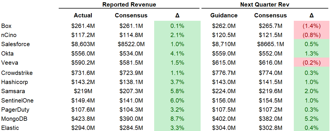
Quarterly Reports Summary
Top 10 EV / NTM Revenue Multiples
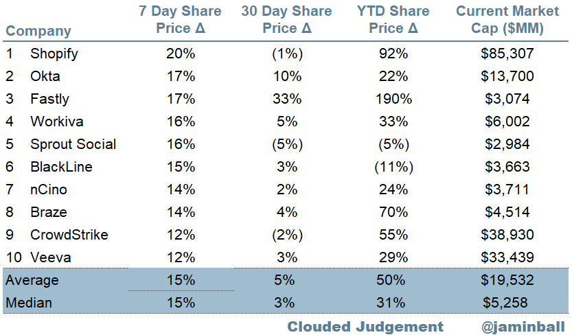
Top 10 Weekly Share Price Movement
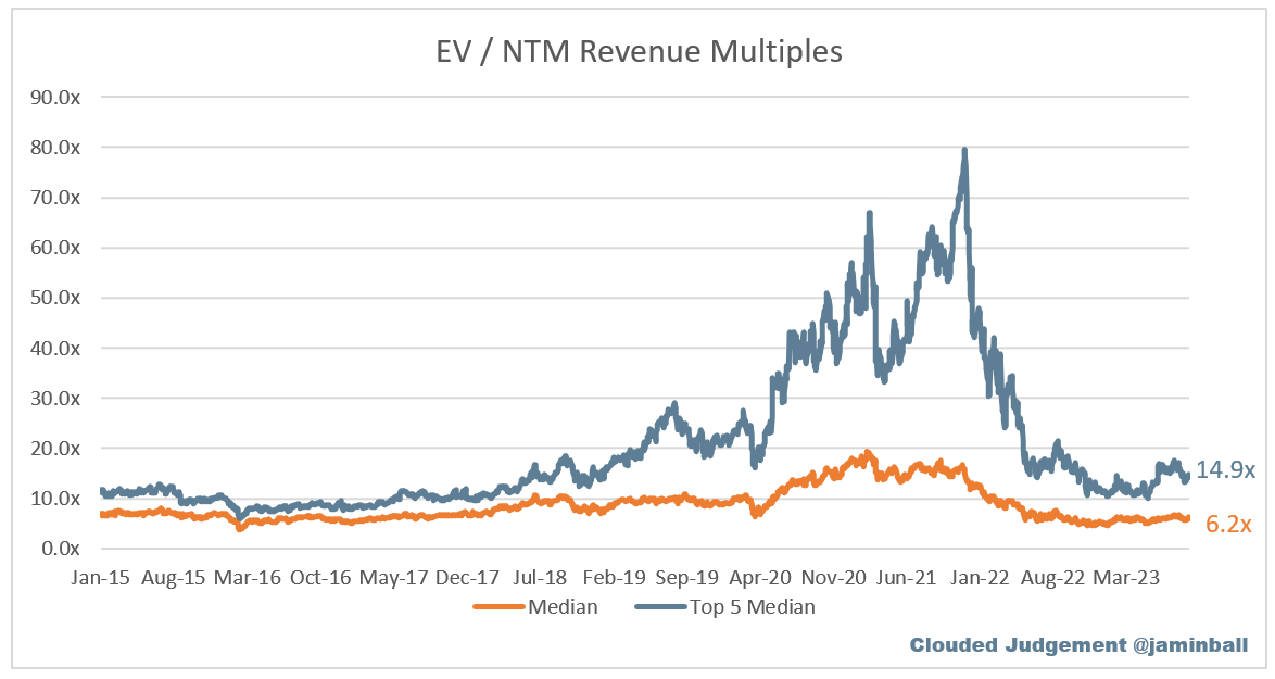
Update on Multiples
SaaS businesses are generally valued on a multiple of their revenue - in most cases the projected revenue for the next 12 months. Revenue multiples are a shorthand valuation framework. Given most software companies are not profitable, or not generating meaningful FCF, it’s the only metric to compare the entire industry against. Even a DCF is riddled with long term assumptions. The promise of SaaS is that growth in the early years leads to profits in the mature years. Multiples shown below are calculated by taking the Enterprise Value (market cap + debt - cash) / NTM revenue.
Overall Stats:
Overall Median: 6.2x
Top 5 Median: 14.9x
10Y: 4.1%
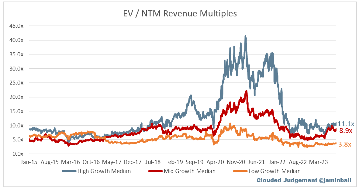
Bucketed by Growth. In the buckets below I consider high growth >30% projected NTM growth, mid growth 15%-30% and low growth <15%
High Growth Median: 11.1x
Mid Growth Median: 8.9x
Low Growth Median: 3.8x
EV / NTM Rev / NTM Growth
The below chart shows the EV / NTM revenue multiple divided by NTM consensus growth expectations. So a company trading at 20x NTM revenue that is projected to grow 100% would be trading at 0.2x. The goal of this graph is to show how relatively cheap / expensive each stock is relative to their growth expectations
EV / NTM FCF
The line chart shows the median of all companies with a FCF multiple >0x and <100x. I created this subset to show companies where FCF is a relevant valuation metric.
Companies with negative NTM FCF are not listed on the chart
Scatter Plot of EV / NTM Rev Multiple vs NTM Rev Growth
How correlated is growth to valuation multiple?
Operating Metrics
Median NTM growth rate: 15%
Median LTM growth rate: 23%
Median Gross Margin: 75%
Median Operating Margin (18%)
Median FCF Margin: 6%
Median Net Retention: 115%
Median CAC Payback: 40 months
Median S&M % Revenue: 43%
Median R&D % Revenue: 27%
Median G&A % Revenue: 16%
Comps Output
Rule of 40 shows rev growth + FCF margin (both LTM and NTM for growth + margins). FCF calculated as Cash Flow from Operations - Capital Expenditures
GM Adjusted Payback is calculated as: (Previous Q S&M) / (Net New ARR in Q x Gross Margin) x 12 . It shows the number of months it takes for a SaaS business to payback their fully burdened CAC on a gross profit basis. Most public companies don’t report net new ARR, so I’m taking an implied ARR metric (quarterly subscription revenue x 4). Net new ARR is simply the ARR of the current quarter, minus the ARR of the previous quarter. Companies that do not disclose subscription rev have been left out of the analysis and are listed as NA.
This post and the information presented are intended for informational purposes only. The views expressed herein are the author’s alone and do not constitute an offer to sell, or a recommendation to purchase, or a solicitation of an offer to buy, any security, nor a recommendation for any investment product or service. While certain information contained herein has been obtained from sources believed to be reliable, neither the author nor any of his employers or their affiliates have independently verified this information, and its accuracy and completeness cannot be guaranteed. Accordingly, no representation or warranty, express or implied, is made as to, and no reliance should be placed on, the fairness, accuracy, timeliness or completeness of this information. The author and all employers and their affiliated persons assume no liability for this information and no obligation to update the information or analysis contained herein in the future.


Appreciate your great content as always. I have a small suggestion, if you don't mind. If you could kindly make one row with white background and the next with very light grey and then white again, it will help to read the master table a lot. Thanks and appreciate your efforts. So helpful!
Great article with lot of details !!!